Kaus Insurance
Brand and Website
Project Summary
This is a conceptual student project for DesignLab UX Academy. Kaus is a national insurance company that is transitioning from sales through regional agents to direct-to-customer sales in order to remain competitive in today's digital marketplace, as more and more people are buying their insurance online. In this project, I worked to create a responsive logo and website for the company.

Challenges
Make a complex and overwhelming experience as easy as possible for customers.
Create brand recognition.
Boost confidence in Kaus as a trustworthy company.
Empathize
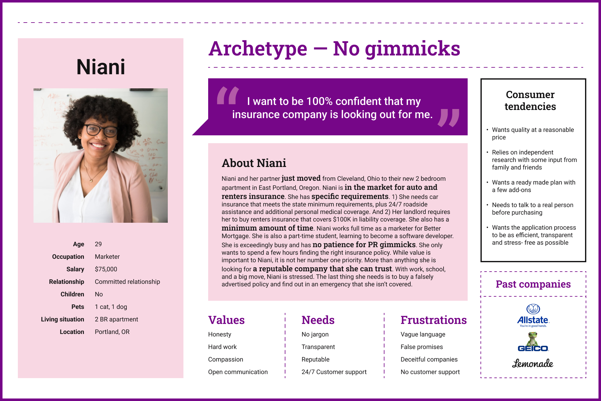
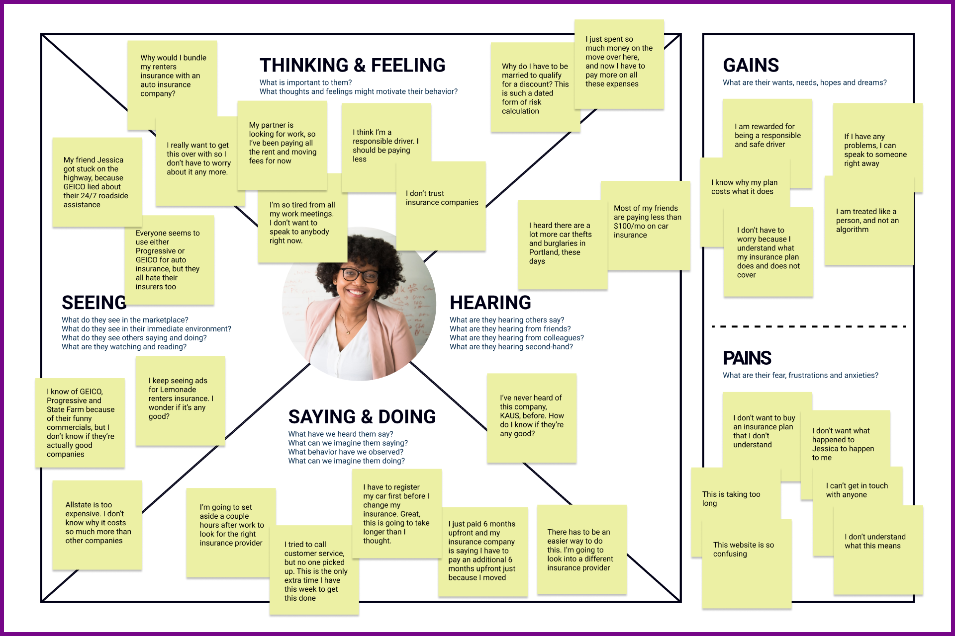
After conducting consumer research, applying for auto and renters insurance myself from multiple companies, and doing a handful of hour long interviews with friends about their experience buying and using insurance products, I identified common pain points and goals, and used this information to create an in-depth customer profile. Meet Niani.
Persona
Empathy Map
Branding (The Kaus Alpaka)
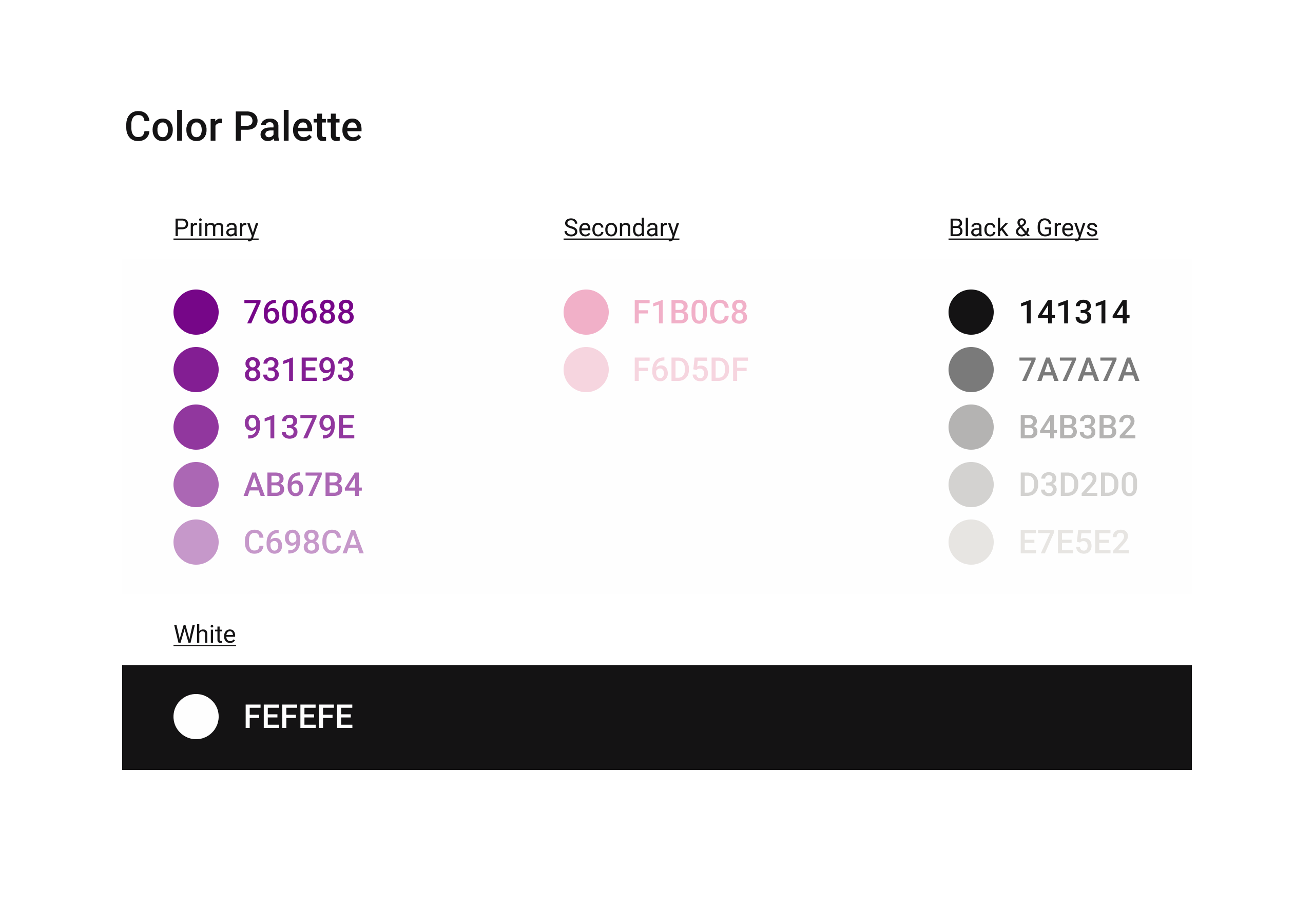
I took a page out of Geico and Liberty Mutual's playbook and used the alpaca as an easily identifiable mascot for the company. I selected the colors berry purple, cream white and salmon and paired these with the soft curves of the Montserrat Alternates Font. All together, these elements express empathy, reassurance, and playfulness.
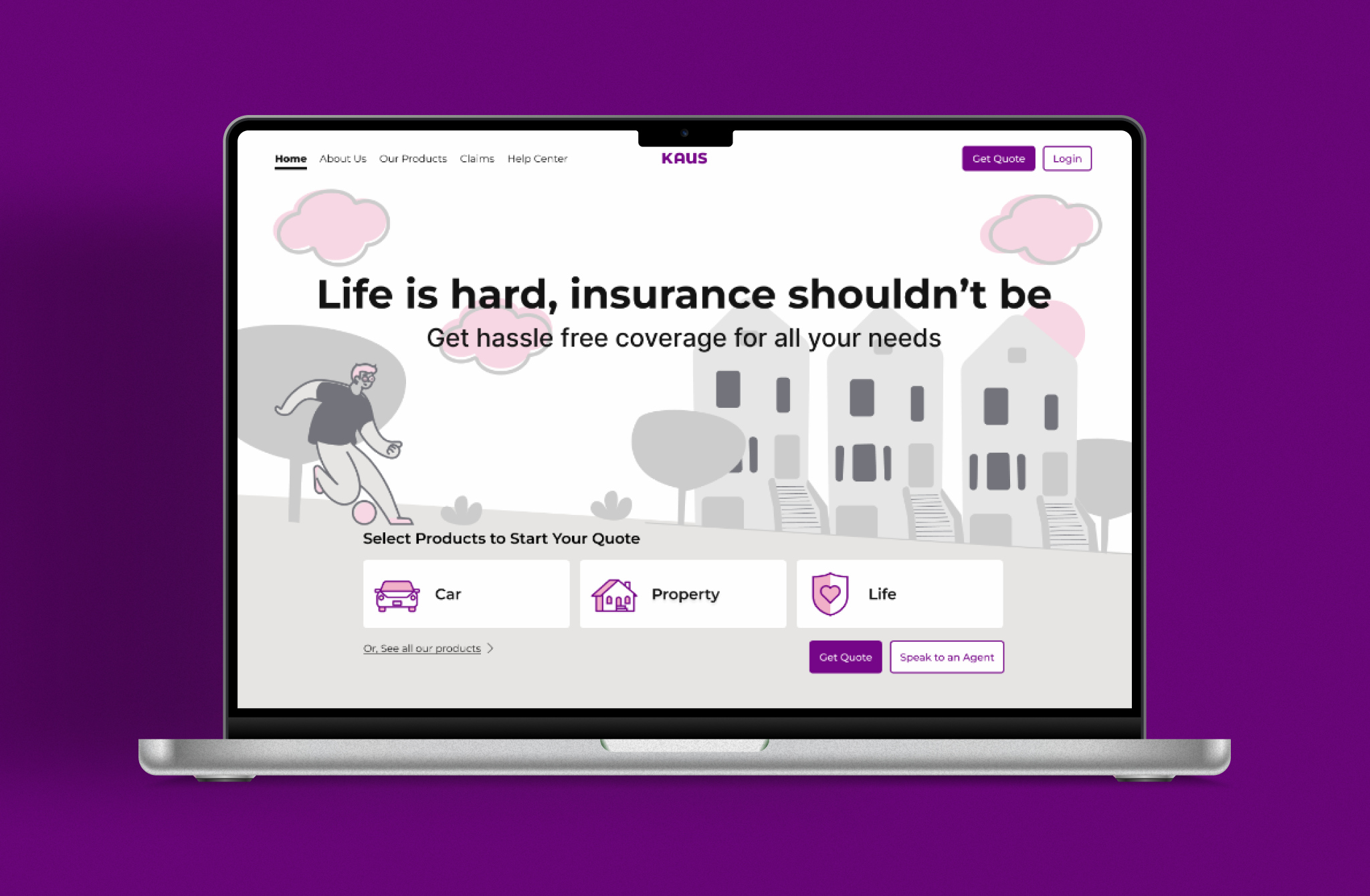
Responsive Logo
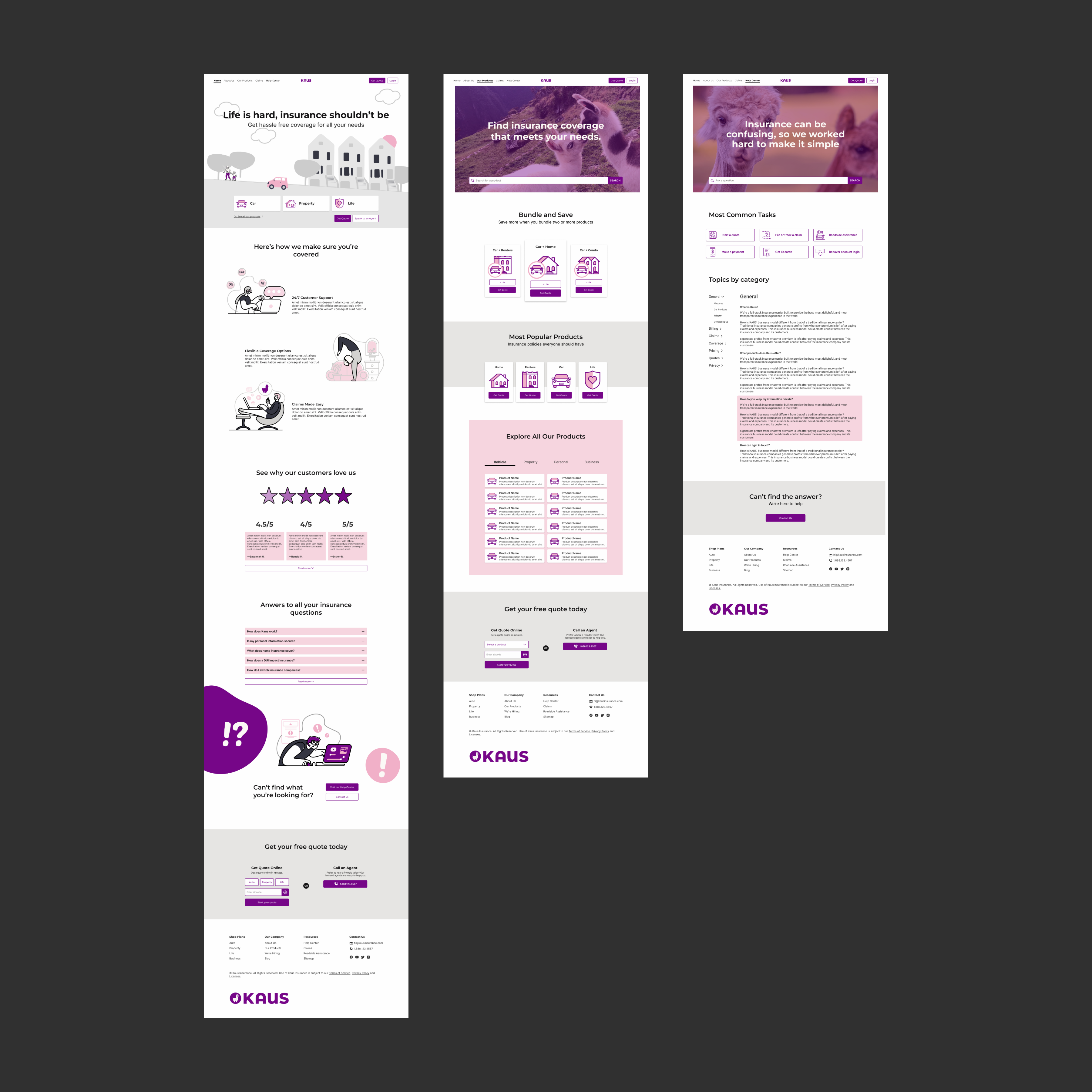
Wireframes to Prototype
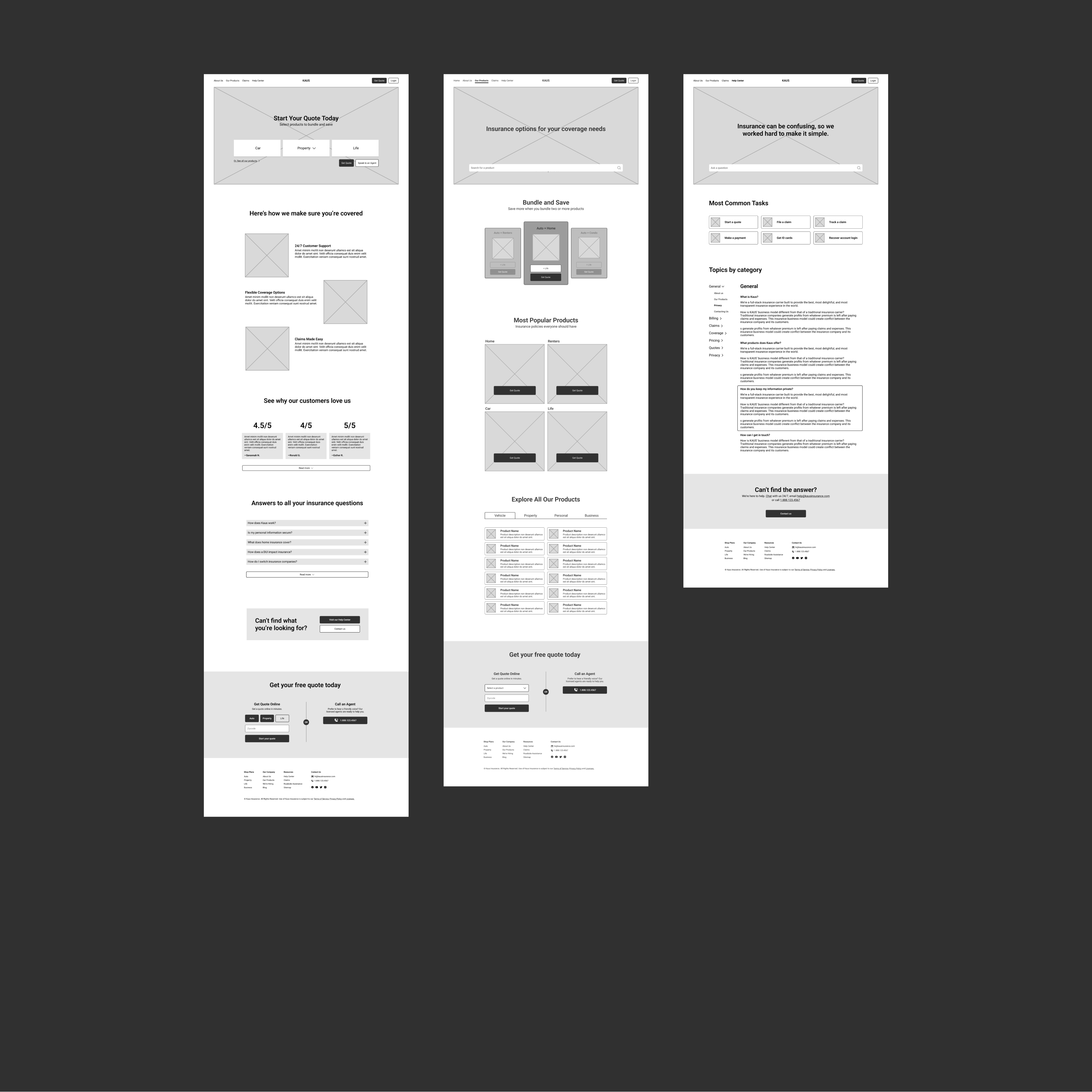
Wireframes
First Prototype
Custom Icons
I created a set of custom icons for Kaus that are consistent with the brand identity of the company. Ideally, every icon on the website would be produced in-house, but this was not possible due to the scope of the project.
Icons
Product Card
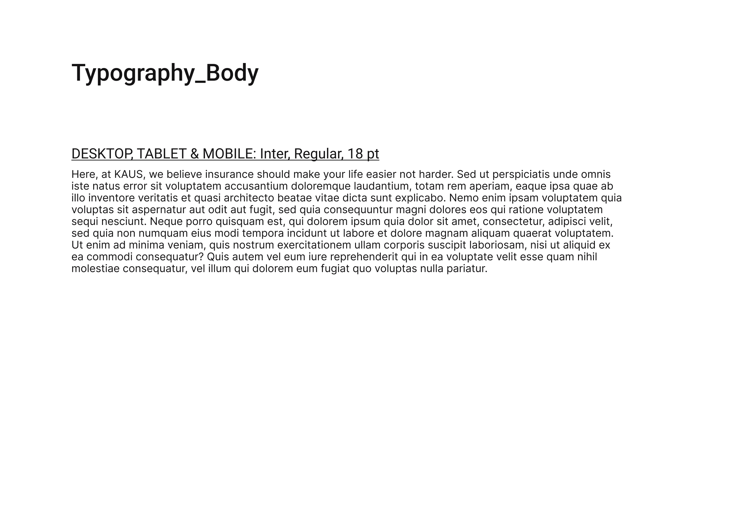
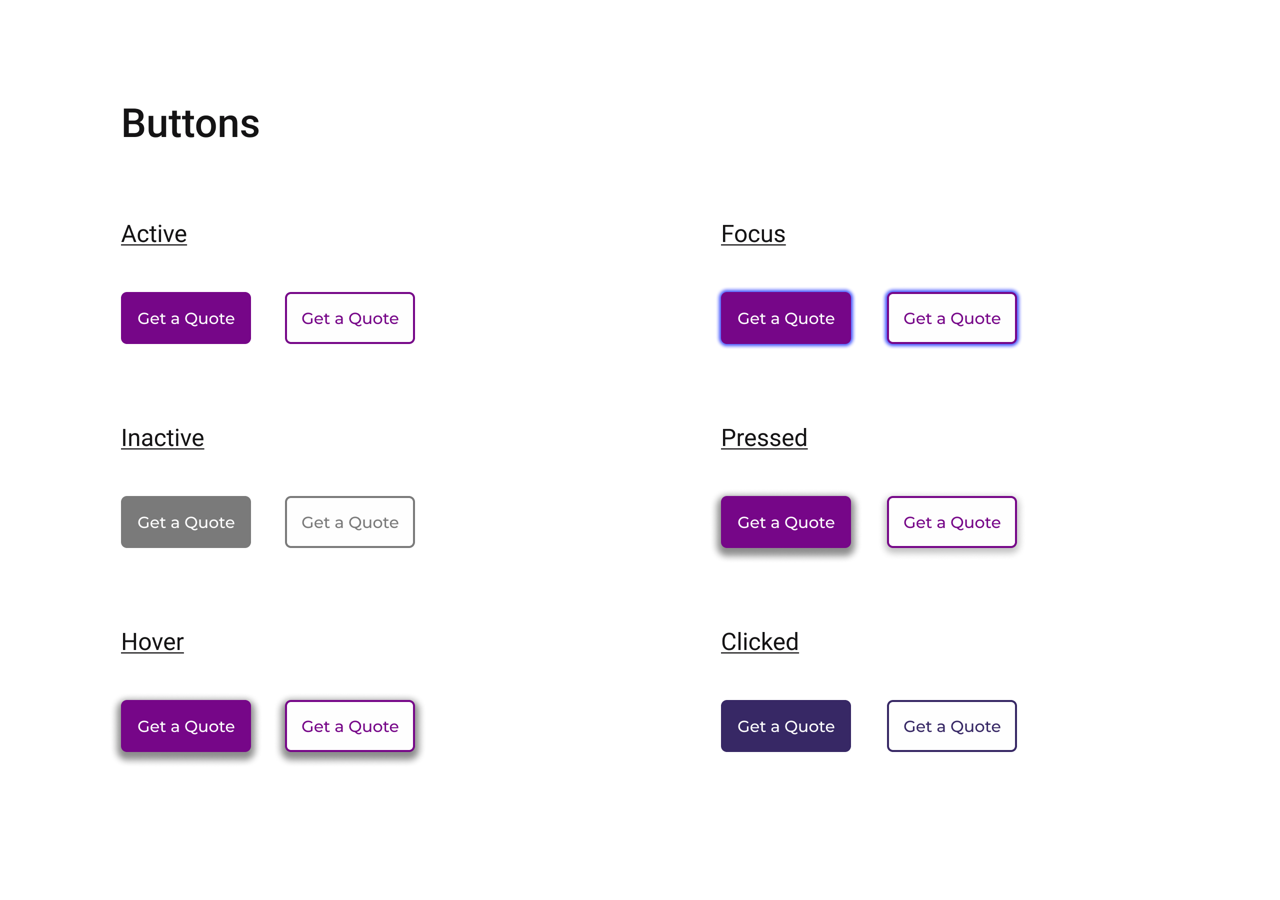
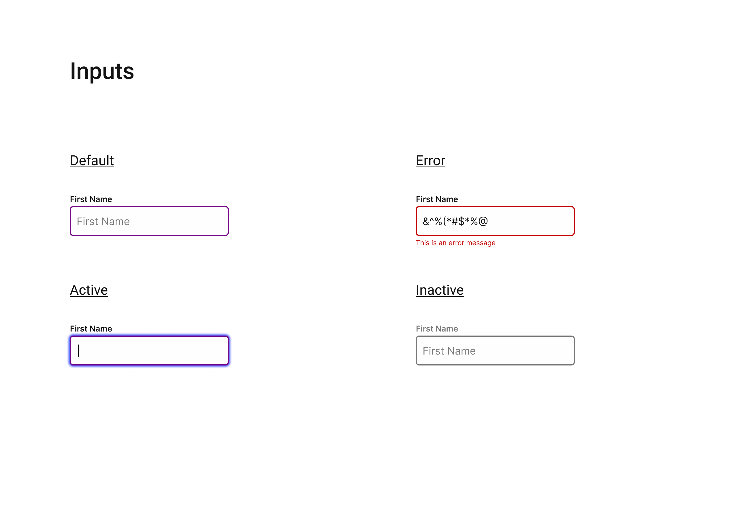
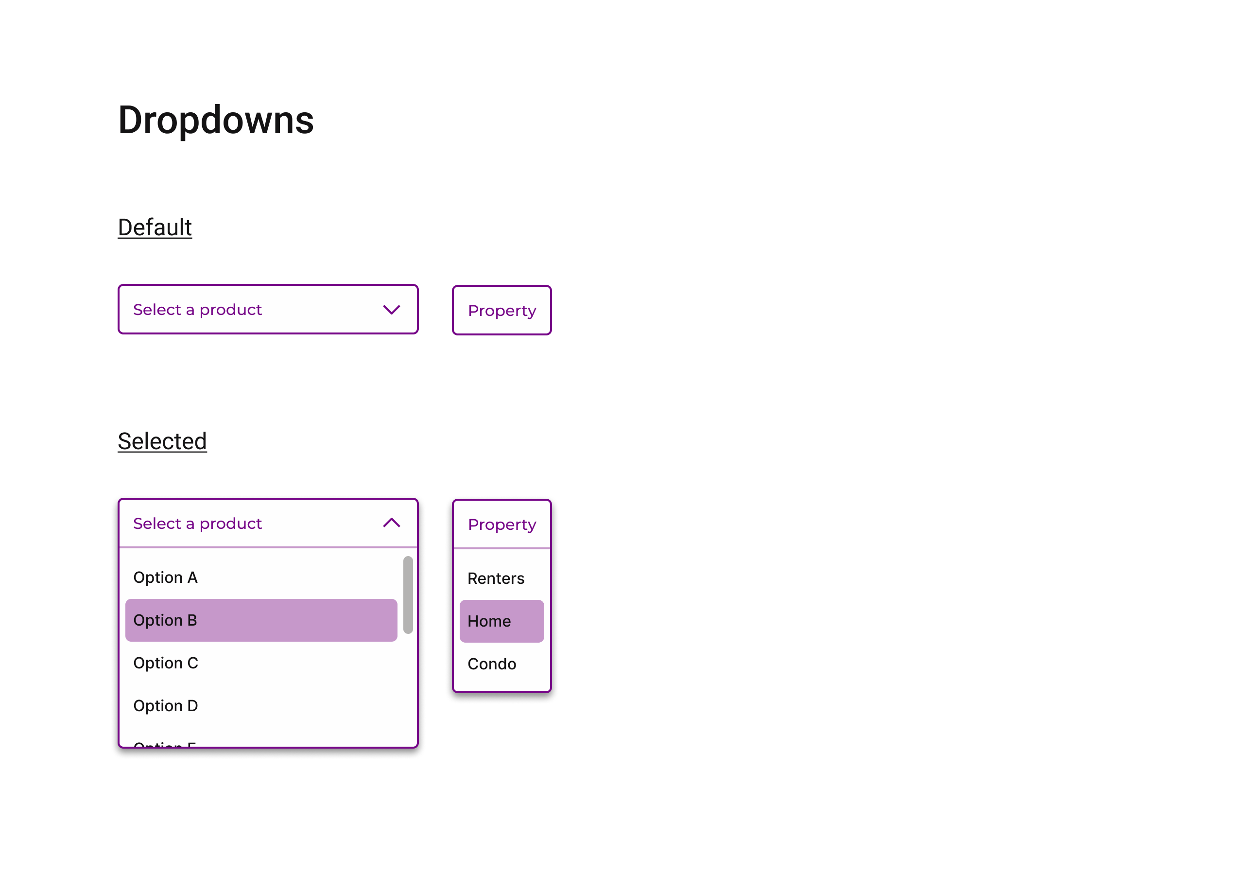
UI Kit
Click through to explore the Kaus UI kit.
Testing the Design
After building a prototype in Figma, I conducted in-person and online user testing, and synthesized the results. From here, I consolidated and reorganized the results into an affinity map and priority matrix to get a clear sense of how best to improve upon the original design.
Priority Revisions
Homepage Revisions
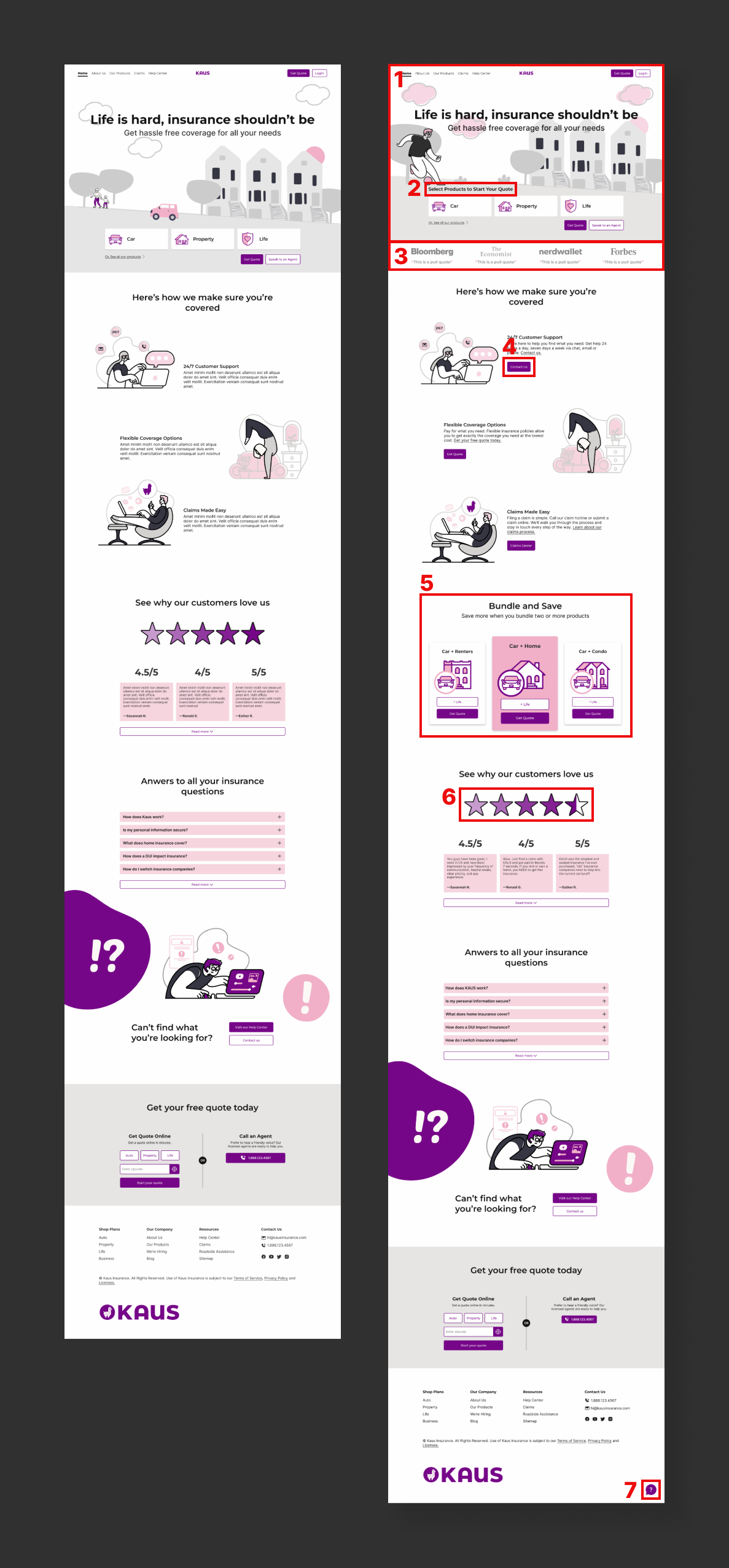
1. Tighten up hero imagery
2. Add expository text
3. Add social proof with pull quotes
4. Add actionable CTA
5. Show bundled products on homepage
6. Change graphics to accurately represent content
7. Add floating help icon throughout website
Get Quote Revision
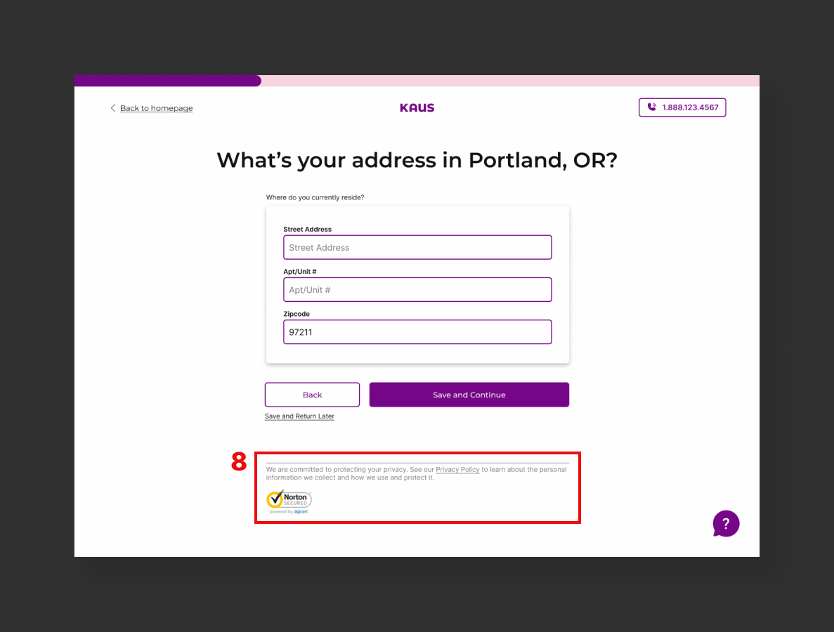
8. A crucial revision that could not be overlooked was the addition of security affordance to ensure the user understood that their information was secure while entering sensitive information into the quote application.
Conclusion
There are many challenges and limitations I found when designing for a product as complicated and convoluted as insurance. UX cannot solve many issues that people face when it comes to insurance such as: mysterious pricing algorithms, inherent racism and discrimination, lack of transparency, clunky outdated technology, and poor to no customer service.
There are many assumptions I have to make, more so because this is a conceptual design. I’m not in communication with real stakeholders, real customers, real insurance experts or real developers. I must make up the products and services this company offers, make up their budget, make up the company’s values, assume they operate in good faith, pretend they have world class customer service and pretend there are no technological restraints.
That said, this project has been immensely educational for me in understanding the research methodologies and step-by-step design processes a UX designer needs to utilize to take an idea and realize it as a serviceable product.

© 2022 Kathy Zhang. Made with  in Portland, OR.