BorderPlex E-Zine
Web Design and Development

Project Overview
BorderPlex is an exhibition and visual storytelling e-zine dedicated to dismantling borders through contemporary digital arts and narratives. The launch issue “Digitizing the Coatlicue State” curated by Pico del Hierro-Villa features photography and digital mixed media pieces by Latinx, queer and trans artists living in borderland communities. BorderPlex gives artists a platform where they can reclaim their identities and divest harmful colonial narratives by telling their own stories. Read more about the exhibition on Hyperallergic.com.
My Role
As the web designer for BorderPlex, I was responsible for creating a visually engaging website to complement the physical exhibition held at Alpaca Gallery in Albuquerque, NM.
Value Proposition
A digital presence is key for artists to reach and engage other artists, collectors and gallerists. The BorderPlex website benefits the project in the following ways.
Increased Visibility
The digital zine and physical exhibition bolster one another for increased visibility, reaching a wider audience.
Promoting Artists
The project's online presence continues to promote artists even after the physical exhibition closes.
Lasting Impact
Framing BorderPlex as a serialized zine establishes a foundation for future issues, ensuring a lasting impact.
Undefined Timelines
Not setting a clear timeline with precise objectives led to inefficiencies, back tracking and wasted efforts.
Poor Communication
Poor communication with the client and logo designer resulted in last-minute changes and errors.
Challenges
I experienced project management and communication challenges while working on this project, which served as important lessons for future projects.
Adapting to a Shifting Project Brief
American Southwest x Yellow Pages
Initial Concept
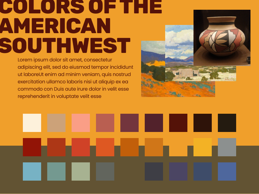
The client's initial concept for BorderPlex was inspired by the local landscape and the Migratory Yellow Pages Project, a zine with practical resources for migrants travelling through the US-Mexico border that is characterized by bold slab serif, plain, legible text and handmade illustrations. Here is a moodboard representing the initial concept. I pulled colors from Southwest landscape paintings and New Mexican Pueblo pottery. I also selected fonts similar to those in the Migratory Yellow Pages.
Cyberpunk x Traditional Meshika
New Project Brief
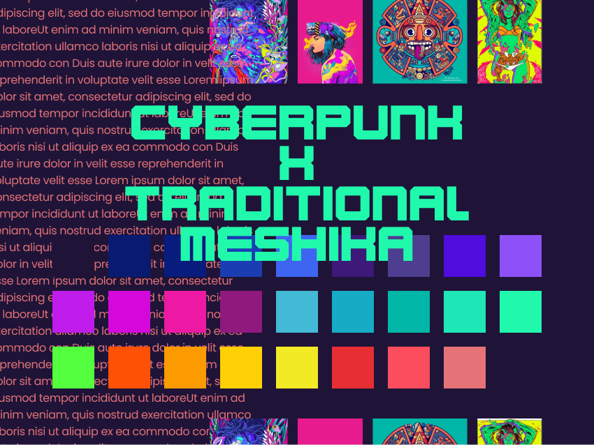
Speaking to the client in a following conversation, they wanted to scrap the dust and sage color palette of the Southwest and the bold printed zine aesthetic. Instead, they wanted to shift to a a mashup style of cyberpunk and traditional Meshika. This change had a big impact on the color palette and design as you can see in this new moodboard.
Logo Integration
While exploring this new visual concept for the project, I considered how to integrate the logo designed by Ruben Loza (below). The black and yellow logo incorporates blocky text with chiseled edges. I chose a display font (Karnivore) similarly blocky and chiseled like the logo text, and paired this with a bitmap font (Press Start 2P) and a geometric sans serif (Poppins) for the body. I pared down my color explorations into a high contrasting neon palette of seven colors that complement those in the logo, and that can be mixed and matched into vibrant combinations.
Zine Mockup
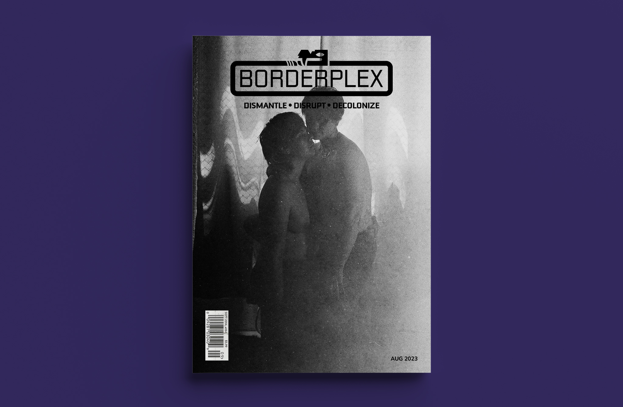
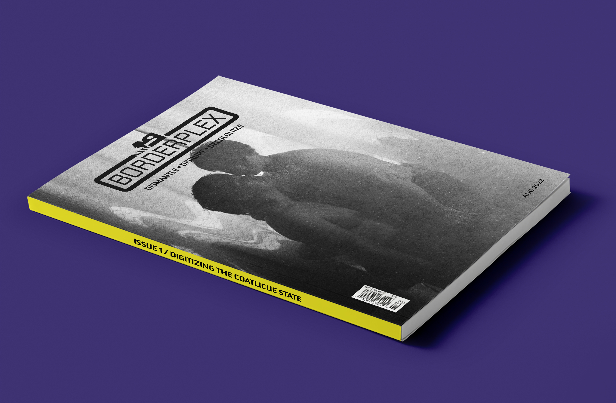
In addition to selecting fonts and colors, I created a magazine-style mockup to reinforce the e-zine concept on the homepage. The photograph on the cover is by Alicia Robinson-Welsh.
Back to Top Button
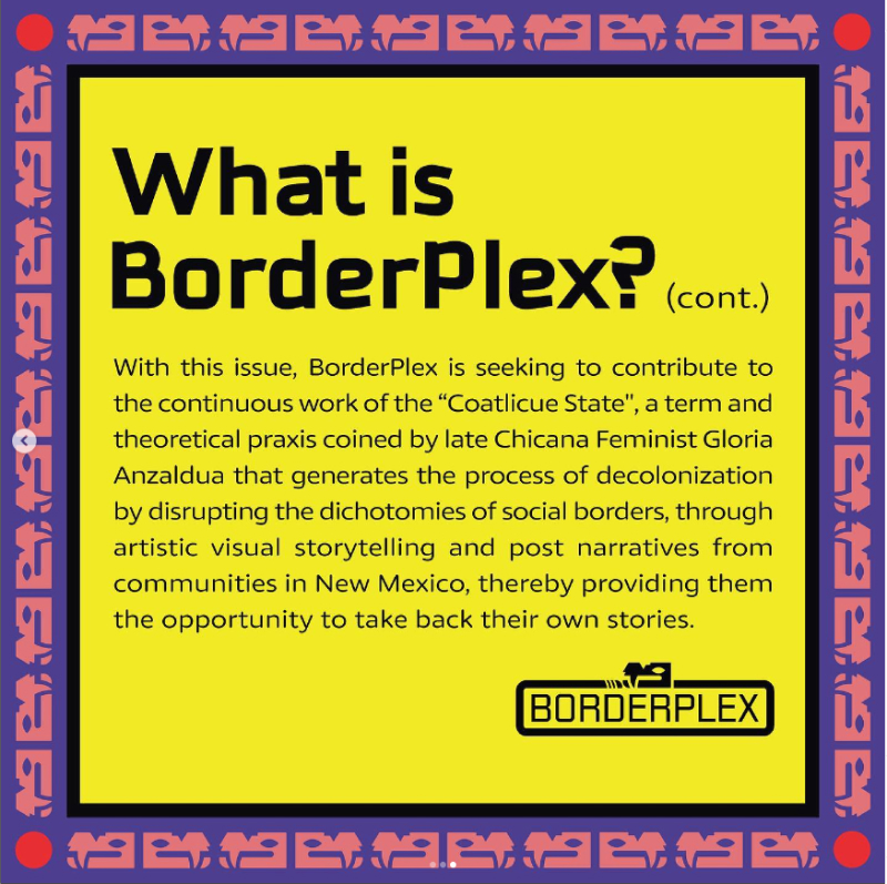
Below is an interactive back to top button I made by incorporating the snake head from the logo. The "Coatlicue State," the inspiration for the first issue of BorderPlex, is a theoretical framework by Chicana feminist Gloria Anzaldúa. It is named after the Aztec goddess Coatlicue who is represented having two snake heads. This design element is a subtle reference to that concept as the source of BorderPlex.
Neutral State

Hover State

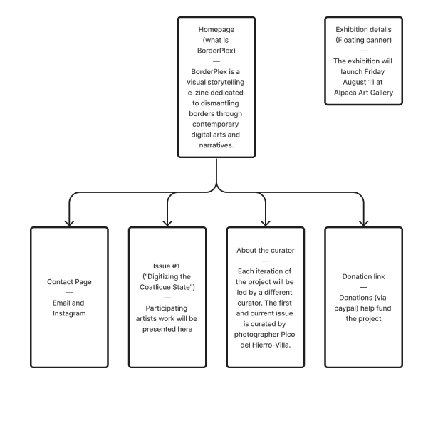
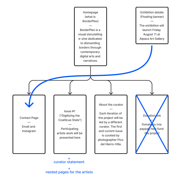
Sitemap Changes
I used the sitemap as a planning tool and made changes as the project concept evolved. The client initially requested a donation page. However, this was taken out of the final design since the first phase of BorderPlex was funded by the City of Albuquerque’s Urban Enhancement Trust Fund. In another change, details about the physical exhibition were relocated to the contact page instead of being displayed sitewide. This decision was based on the fact that exhibition attendees gained access to the site on the event day. Most site users would be aware of the exhibition beforehand, making the exhibition details less important.
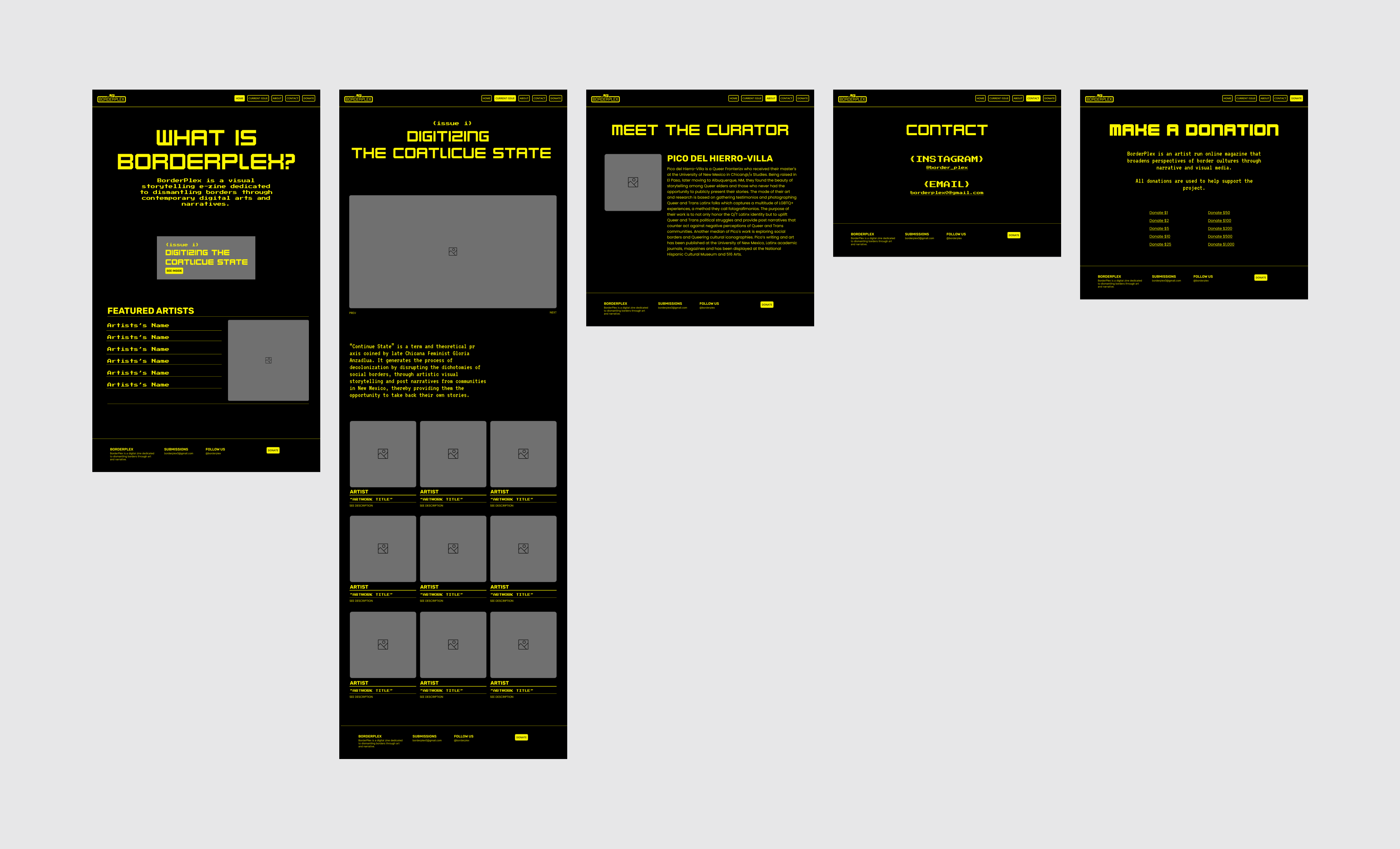
Low Fidelity Mockups
After creating a sitemap I mocked up low fidelity desktop screens.
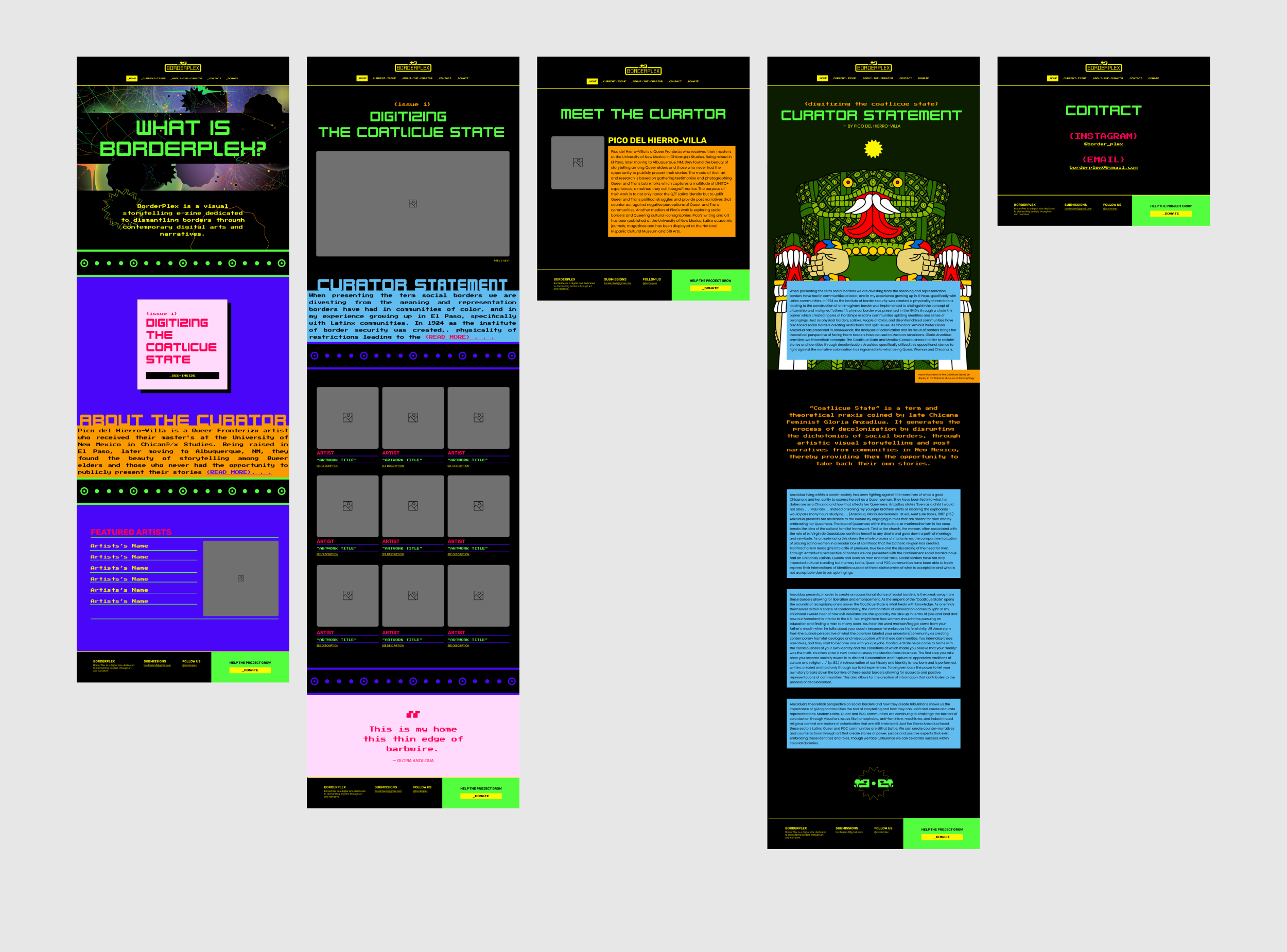
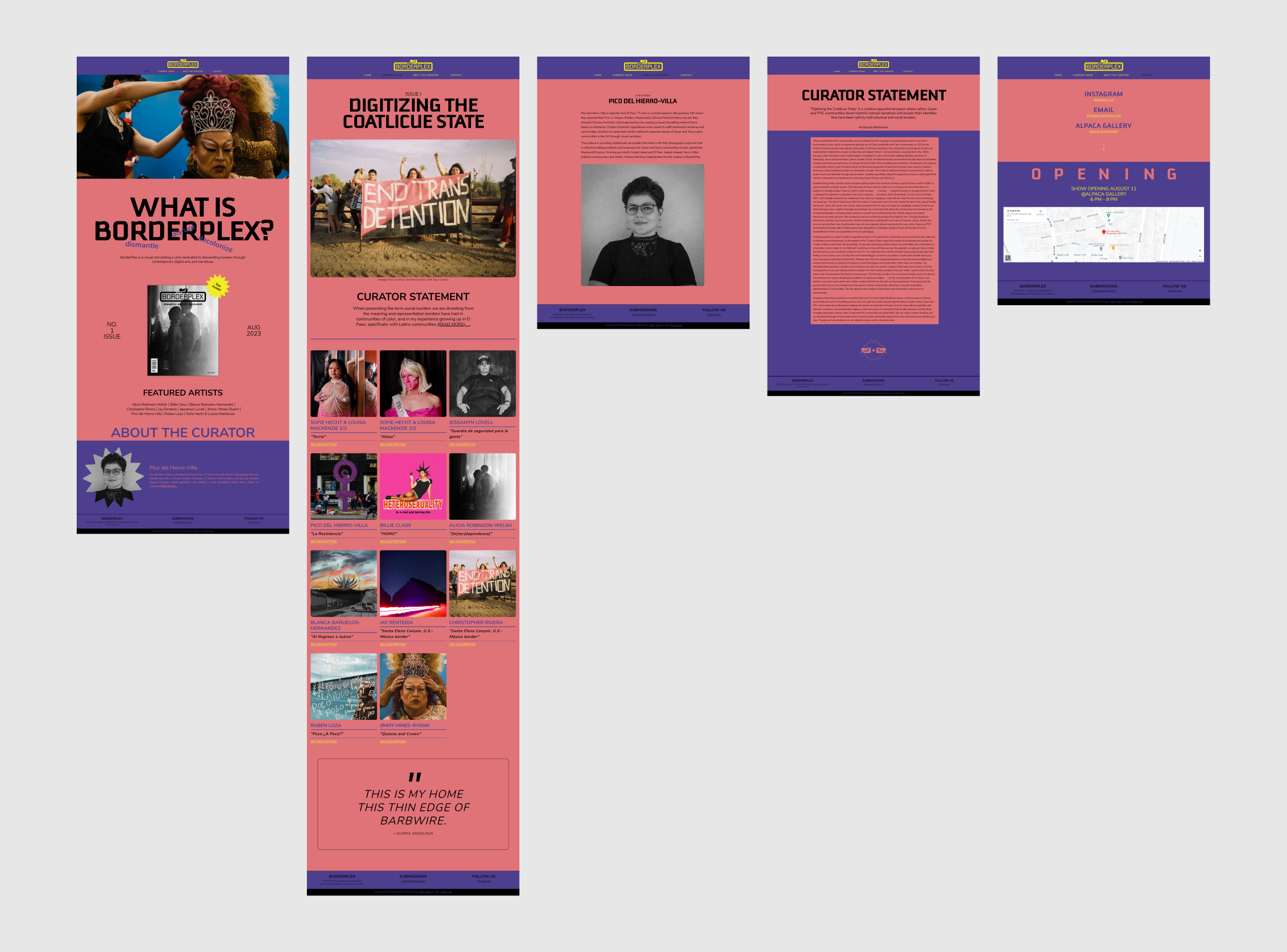
Hi-Fi Mockups vs Final Product
What happened here? As you can see, there is a vast difference between the hi-fidelity mockups (left) and the final product (right). I built the website according to the mockups. However, the client requested major revisions in the final days leading up to the launch.
Click and drag to see changes
Divergent Branding Strategies
Even though I was given freedom to design the website as I see fit, fundamental aspects of my designs were rejected in the final stages after the website had already been built. Throughout the design process, I had no opportunity to talk to let alone collaborate with the logo designer. This absence of communication and collaboration seriously impacted the overall design strategy, such that two designers ended up creating two divergent branding strategies. In an ideal scenario, I would have been able to discuss Loza's reasoning for the logo, and jointly brainstorm the visual direction for the project.
Last Minute Changes
In another example of poor communication, the client solidified the visual identity with the logo designer without notifying me. I also fell short on my end by not keeping the client up to date with deliverables. This led to substantial misalignment on the project's visual direction. Consequently, I was tasked with a last-minute design overhaul in order to match designs from the project's instagram page.
IG post designed by Ruben Loza
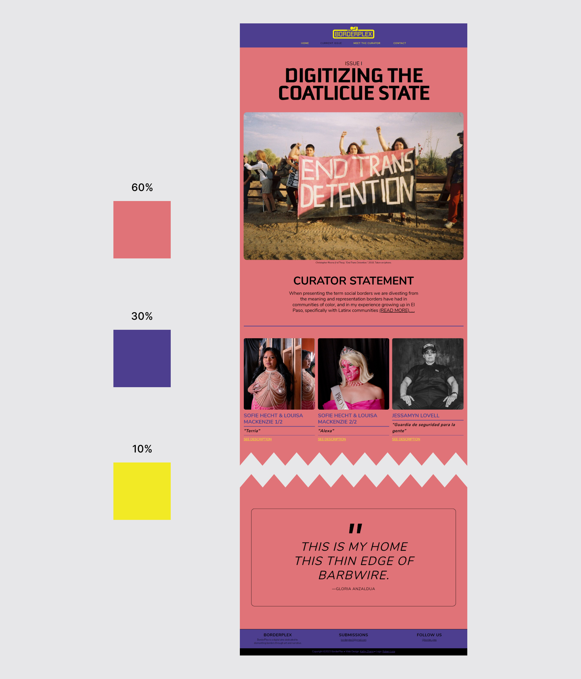
Redesigning Using the 60-30-10 Rule
The 60-30-10 rule is a shorthand guide for creating contrast, harmony, and hierarchy with a limited palette. Following this rule, I selected salmon pink (#E07378) as the neutral, dominant color and used it in the majority (60%) of the design. Purple haze (#4D3E8E) was an obvious choice for a complementary secondary color taking up 30% of the design. I saved the highlighter yellow (#F2EA23) as an accent, using it sparingly (10%) for the logo, hyperlinks and other standout elements. Lastly, I omitted the color red, because it competed visually with the yellow accent.
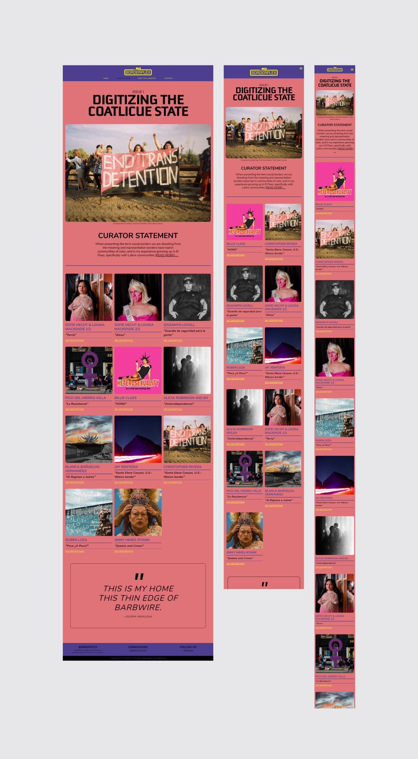
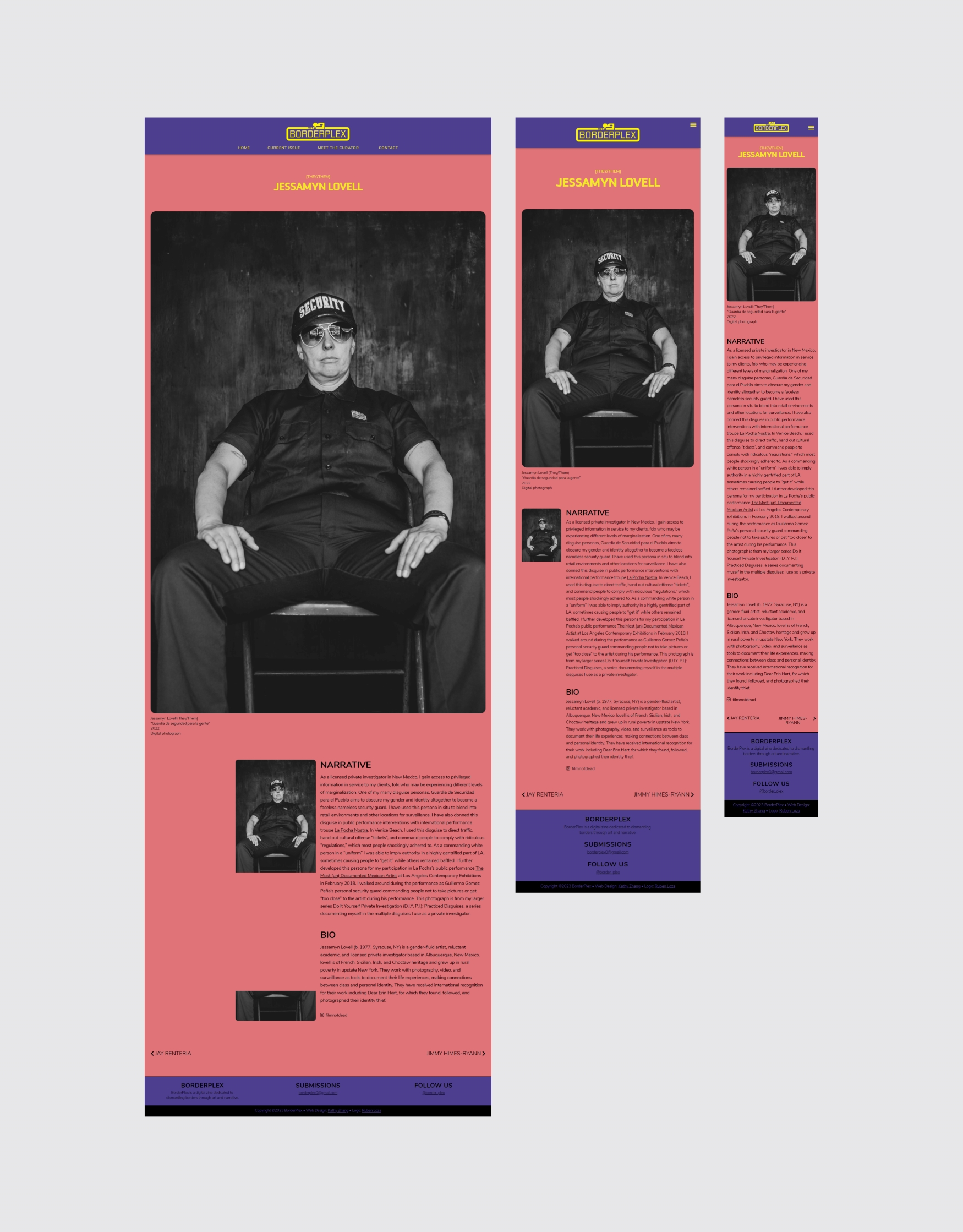
Artist Pages
After the homepage, the most important design to get right were the artist pages. Below is a screencapture of the page for performance artist and photographer Jessamyn Lovell.
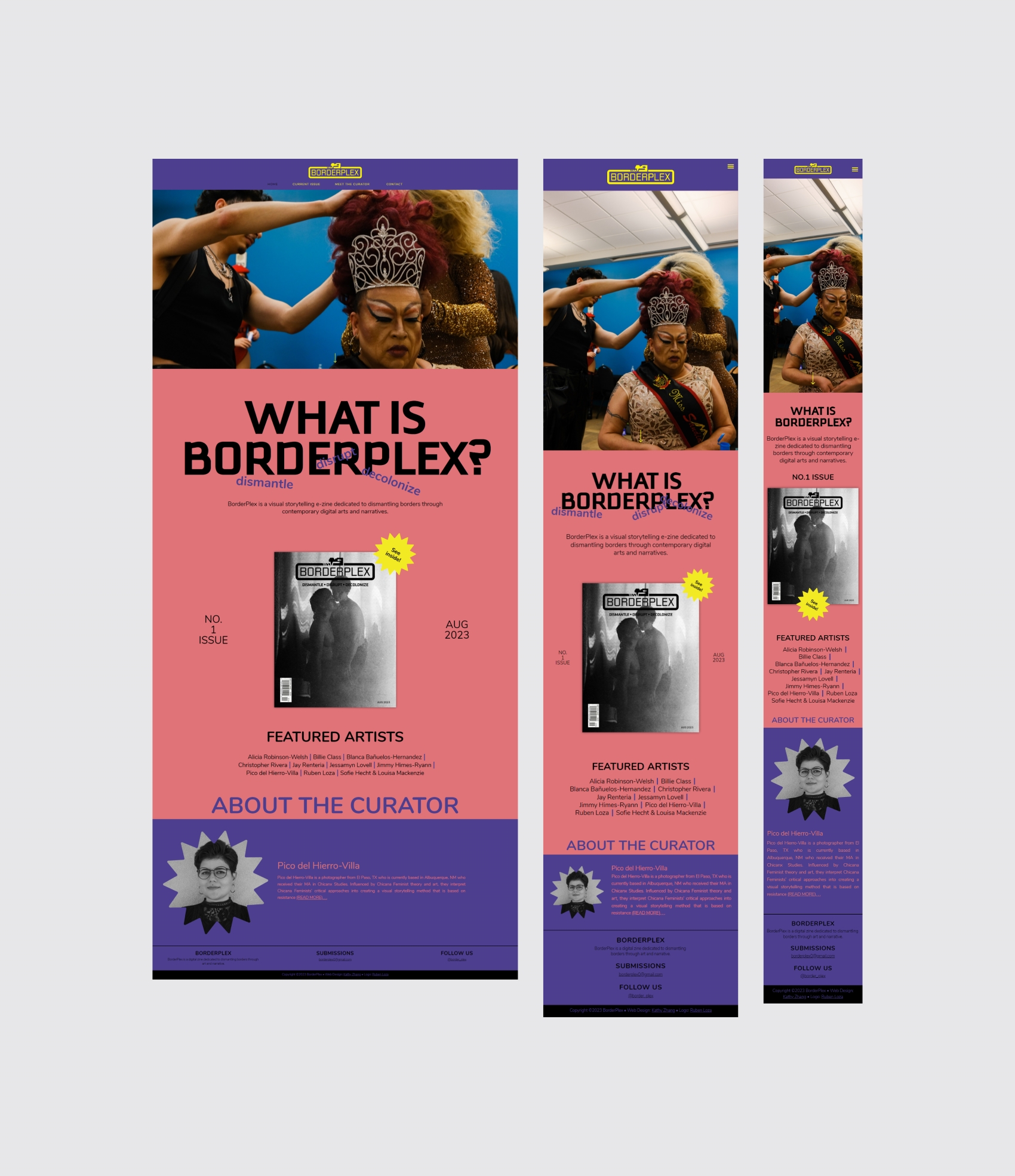
Responsive Design
I designed for desktop first and afterwards built cross-device responseness in the web builder.
The Final Stretch
In a final stretch effort to avoid further confusion, I followed up my last client meeting with an email to reiterate the changes that were requested and what I could accomplish before the exhibition opening. Despite my efforts, the client asked the logo designer to make additional changes that were not mentioned in the meeting and did so without my knowledge. These changes created errors that sat on the website for weeks before anyone noticed. These could have been resolved earlier or avoided completely had communication been prioritized.
Errors
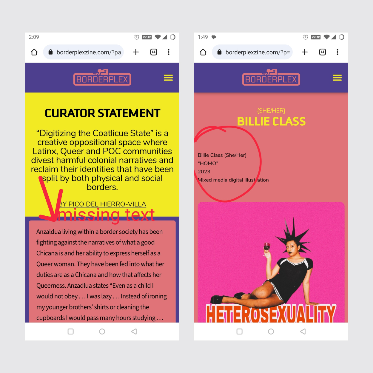
In the screenshot on the left, a paragraph was deleted from the curator statement. As well, black text was placed on a wall of bright yellow, which strains the eye and disrupts the 60-30-10 heirarchy on the page. On the right, a caption was misplaced appearing above the artwork instead of below.
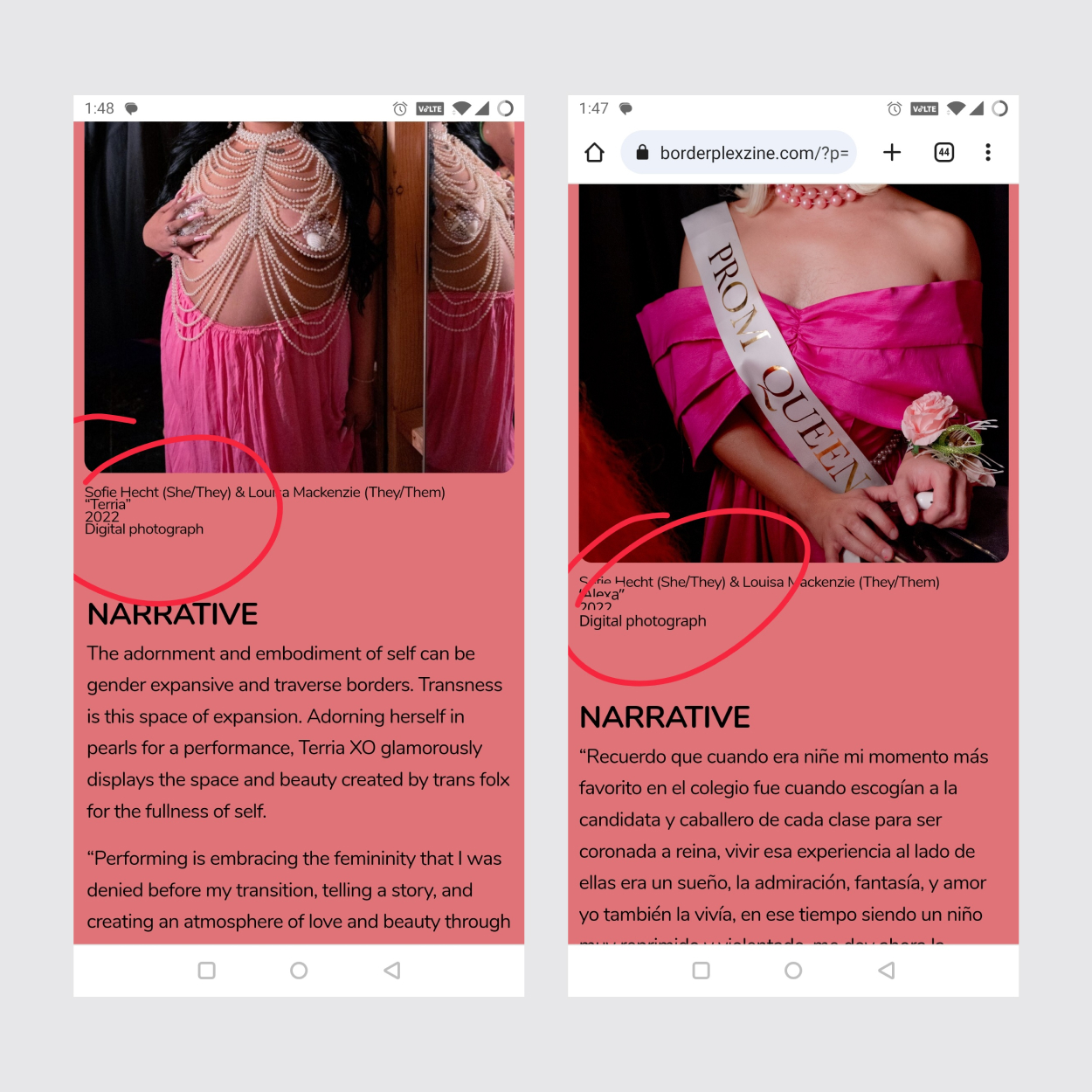
The line height for captions was all over the place. In some places, the text was overlapping one another.
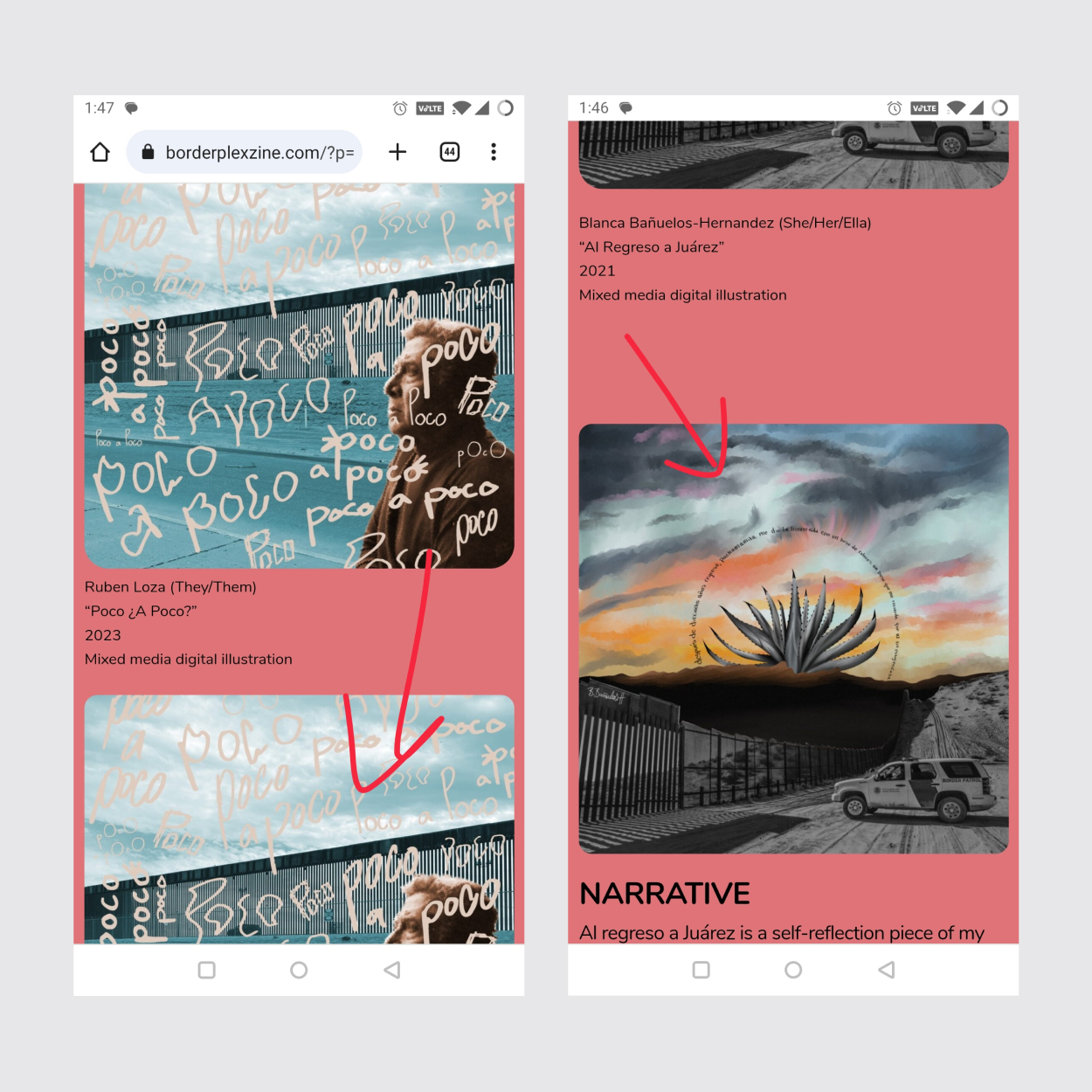
The artwork appears in duplicate on these screenshots.
Continuous Growth and Reflection
While facing challenges, this project served as a significant learning experience. It taught me the technical know-how to build a website and reinforced the crucial importance of clear and continuous communication. For creative collaboration to work, all parties involved must understand the project timeline and each team member’s role. The experience also taught me how much deliverables matter. Always send deliverables to your client, even if they do not ask for it. Providing deliverables ensures alignment with the client and saves you from the purgatory of endless feedback loops and painstaking late-stage revisions. These are lessons I am eager to apply to future projects.
© 2022 Kathy Zhang. Made with  in Portland, OR.